


TL;DR:
- These 10 design mistakes are silently draining your revenue. The average ecommerce store converts at just 1.4%. Optimized stores hit 2.5% to 3%. That gap is almost always caused by fixable design errors.
- Each mistake below includes a 60-second self-check you can run on your own store right now, plus the specific fix with tools and steps.
- Quick Answer: Slow mobile speed, missing trust signals, and checkout friction are the three most expensive ecommerce website design mistakes, collectively responsible for up to 40% of lost sales.
Table of Contents
Your store looks great. Your products are solid. Traffic is coming in. But the sales? They’re not where they should be.
Here’s the uncomfortable truth: ecommerce website design mistakes are invisible to the store owner but painfully obvious to the shopper. You don’t see the visitor who left because your page took 4 seconds to load. You don’t see the customer who abandoned checkout because they didn’t trust your payment security. You just see a dashboard with disappointing numbers.
The average ecommerce conversion rate sits at just 1.4% according to Littledata. Well-optimized stores hit 2.5% to 3%. That’s nearly double the revenue on the exact same traffic. The difference almost always comes down to design decisions, not product quality or ad spend.
At BK Web Designs, we’ve audited over 350 ecommerce stores across Shopify, WooCommerce, and custom platforms. The same mistakes appear over and over. Below, we’ve ranked the 10 most expensive design mistakes from highest revenue impact to lowest. Each one includes the data behind the damage, a self-check you can run in 60 seconds, and the specific fix.
📥 Free Resource: Want to audit your entire store systematically? Download our free 27-Point E-Commerce Conversion Checklist. It covers every mistake in this article plus 17 more.
Download Free Checklist →
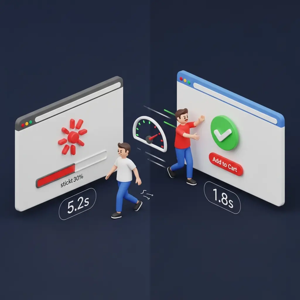
1. Slow Mobile Page Speed: The Silent Revenue Killer
Revenue Impact: Google’s research confirms that 53% of mobile visitors abandon a site if it takes longer than 3 seconds to load. For a store doing $10,000/month, a 1-second improvement in load time can translate to a 7% revenue increase, roughly $700/month or $8,400/year.
Speed is the foundation everything else sits on. It doesn’t matter how beautiful your product pages are or how persuasive your copy is if visitors never see them. Every additional second of load time increases bounce rates exponentially. Yet most store owners have never actually tested their site speed on a real mobile connection.
The culprits are almost always the same: uncompressed images, too many apps or plugins injecting JavaScript, render-blocking scripts, and bloated theme code. On a recent client audit, we found a Shopify store with 28 installed apps. Fourteen of them were either unused or redundant. Removing them dropped page load time from 6.2 seconds to 2.1 seconds.
60-Second Self-Check
Open Google PageSpeed Insights and enter your store URL. Click the “Mobile” tab. If your performance score is below 50 or your Largest Contentful Paint (LCP) exceeds 2.5 seconds, speed is actively costing you sales right now.
The Fix
- Compress all images. Use TinyIMG (Shopify) or ShortPixel (WooCommerce) to bulk-optimize. Target under 100KB per product image.
- Audit your apps and plugins. Remove anything you installed “to try” and forgot about. Each one adds JavaScript that slows your store.
- Enable lazy loading. Images below the fold should only load when the visitor scrolls to them. Most modern themes support this natively.
- Use your platform’s CDN. Shopify includes one automatically. For WooCommerce, Cloudflare’s free tier handles this.
2. No Trust Signals Above the Fold: Visitors Don’t Feel Safe
Revenue Impact: Baymard Institute’s research shows that adding trust badges and security indicators to key pages increases checkout completion by an average of 17%. The Stanford Web Credibility Research found that 75% of consumers judge a business’s credibility based on visual website design alone.
When a first-time visitor lands on your store, their brain makes a split-second decision: “Is this legit?” If they don’t see immediate proof that your store is trustworthy, they leave. No browsing. No product clicks. Just gone. The psychological mechanism is simple. Online shoppers are spending money with a stranger. They need reassurance before they’ll even consider it.
The most common version of this mistake? A beautiful hero image with zero trust indicators. No review count. No security badges. No shipping policy. No “trusted by X customers” social proof. The store looks pretty but doesn’t answer the one question every visitor is silently asking: “Can I trust this?”
60-Second Self-Check
Open your homepage on your phone. Without scrolling, can you see at least three of these: a customer review count or star rating, a secure payment badge, a shipping/return policy summary, or an “as seen in” or “trusted by” indicator? If you can’t see at least three without scrolling, you’re losing first-time visitors.
The Fix
- Add a trust bar directly below your hero section. Include 4 to 5 icons: free shipping threshold, return policy, secure checkout, review count, and any press logos.
- Display aggregate review stars on your homepage. Something like “Rated 4.8/5 by 2,400+ customers” is powerful social proof above the fold.
- Show payment method logos. Visa, Mastercard, PayPal, Shop Pay, Apple Pay. Familiar logos trigger subconscious trust.
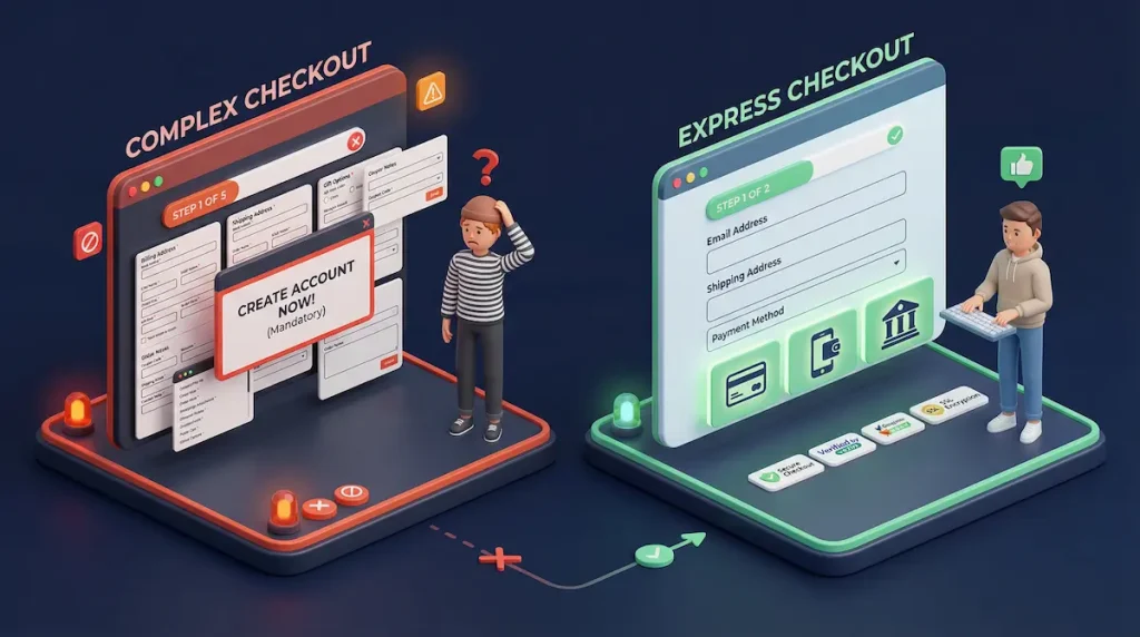
3. Complicated Checkout Process: Too Many Steps, Too Many Fields
Revenue Impact: The average cart abandonment rate across ecommerce is 70.19% according to Baymard Institute’s analysis of 49 different studies. Their research identifies checkout complexity as a leading cause, with 22% of shoppers abandoning because the process was too long or complicated.
Every additional form field, every extra page, every unexpected cost is a chance for your customer to reconsider. And “reconsider” almost always means “leave.” The psychology here is friction. Your customer has already made the emotional decision to buy. Your checkout’s job is to not talk them out of it.
On a recent WooCommerce client project, we found a 5-step checkout with 23 form fields, mandatory account creation, and shipping costs that didn’t appear until the final step. We rebuilt it as a 2-step checkout with 8 fields, guest checkout enabled, and shipping costs visible on the cart page. Their cart abandonment dropped from 81% to 62% within three weeks.
60-Second Self-Check
Add a product to your cart and go through your entire checkout on your phone. Count the number of form fields. Count the number of pages or steps. Time how long it takes. If there are more than 8 fields, more than 2 steps, or it takes longer than 90 seconds, you’re bleeding sales.
The Fix
- Enable guest checkout immediately. Forced account creation kills 24% of potential sales according to Baymard. On Shopify, go to Settings, then Checkout, then select “Don’t require account.”
- Reduce form fields to 7 or 8. Name, email, address, city, state, zip, card details. That’s it. Auto-detect city and state from zip code where possible.
- Show total costs early. Display shipping, taxes, and fees on the cart page. Never surprise customers at the final step.
- Enable accelerated payments. Shop Pay, Apple Pay, Google Pay, and PayPal Express let returning customers check out in seconds.
4. Poor Product Photography and Descriptions: Failing to Sell
Revenue Impact: Products with high-quality images receive 94% more views than those with poor visuals. Detailed product descriptions reduce return rates by up to 50%. In a world where customers can’t touch, hold, or try your product, your images and words are the entire sales experience.
The most common version of this mistake is a single product photo taken on a phone with bad lighting, paired with a description that lists features instead of selling benefits. “100% cotton, machine washable, available in 3 colors” tells the customer what the product is. It doesn’t tell them why they should buy it. Your competitor’s page says “The softest tee you’ll ever own. Wash it 100 times and it gets better, not worse.” Same product. Different conversion rate.
60-Second Self-Check
Open your top 3 best-selling products. For each one, count the photos. Is there a lifestyle image showing the product in use? A size reference? Multiple angles? A video? Now read the description. Does it lead with benefits or features? If you have fewer than 5 images and your description starts with specifications, this mistake is costing you.
The Fix
- Minimum 5 to 8 images per product. Include: white background, lifestyle/in-use, close-up texture, size reference, and packaging.
- Add video. Even a simple 15-second clip showing the product being used increases conversion significantly. A smartphone and natural light are enough.
- Rewrite descriptions in benefit-first format. Lead with the outcome the customer wants. Follow with features as supporting evidence. Use short paragraphs and bullet points.
- Include sizing, dimensions, or comparison info. “How big is it actually?” is one of the top questions that prevents purchase decisions.
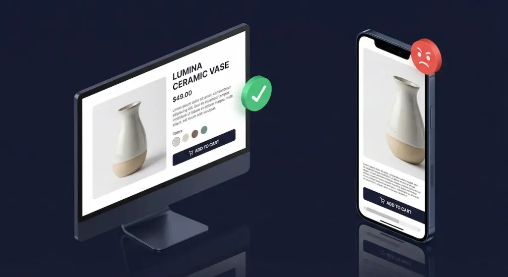
5. Missing or Hidden Mobile Navigation: Visitors Can’t Find Products
Revenue Impact: Mobile devices account for 77% of ecommerce site traffic globally according to recent Statista data. If your mobile navigation is confusing, buried, or broken, you’re making it hard for three-quarters of your visitors to find what they’re looking for. And when people can’t find products, they don’t search. They leave.
The problem often starts with desktop-first thinking. Your mega-menu with 12 categories and 40 subcategories looks organized on a 27-inch monitor. On a phone, it becomes an endless scroll of tiny text links that nobody can navigate with their thumb.
60-Second Self-Check
Open your store on your phone. Try to navigate to a specific product using only the menu (don’t use search). Time yourself. If it takes more than 3 taps to reach any product, or if you feel confused at any point, your mobile navigation needs work.
The Fix
- Limit top-level mobile categories to 5 to 7. Use expandable sub-menus for deeper categories. Prioritize by sales volume, not alphabetical order.
- Make the search bar prominent and persistent. On mobile, a sticky search icon in the header can catch visitors who’d otherwise leave. Consider Searchanise or Boost Commerce for smart autocomplete.
- Add “quick shop” categories. “Best Sellers,” “New Arrivals,” and “On Sale” are navigation shortcuts that match how mobile shoppers actually browse.
6. No Social Proof or Reviews on Product Pages
Revenue Impact: The Spiegel Research Center at Northwestern University found that the purchase likelihood for a product with five reviews is 270% greater than a product with no reviews. That’s not a marginal improvement. It’s a 3.7x multiplier on your conversion rate for every product that has reviews visible.
Reviews serve as third-party validation. When a stranger says “this product is great,” it carries more weight than anything you write in your product description. The absence of reviews doesn’t just mean you’re missing a bonus. It actively creates doubt. Shoppers think: “Nobody has bought this? Is something wrong with it?”
On a recent Shopify store redesign, we moved the client’s review widget from a buried tab at the bottom of the page to a star rating summary directly under the product title. No new reviews were added. Just moved the existing ones to a visible position. Their add-to-cart rate increased by 22% in the first two weeks.
60-Second Self-Check
Open any product page on your store. Can you see a star rating or review count without scrolling? If reviews exist but are hidden in a tab, below the fold, or on a separate page, they might as well not exist. Also check: do you have photo reviews? Photo reviews generate significantly more trust than text-only reviews.
The Fix
- Install a review app and display stars above the fold. Judge.me (affordable) or Loox (photo-focused) for Shopify. For WooCommerce, use the built-in review system or WooCommerce Product Reviews Pro.
- Enable photo reviews. Customers uploading their own product photos is the most powerful social proof available.
- Show the review count on collection pages. “★★★★★ (127)” under a product thumbnail on your shop page creates social proof before the customer even clicks through.
- Actively request reviews. Set up a post-purchase email sequence (7 days after delivery) asking for a review. Offer a 10% discount on their next order as an incentive.

7. Weak or Missing Calls-to-Action: Visitors Don’t Know What to Do
Revenue Impact: Your call-to-action button is the single most important element on any product page. If it’s hard to find, blends into the background, or uses vague text like “Submit,” you’re creating hesitation at the exact moment of decision. CTA optimization alone can lift conversions by 20% to 30% in many cases.
The most common CTA failures: buttons that are the same color as the background, tiny buttons on mobile that are hard to tap, generic text like “Submit” or “Continue” instead of action-oriented language, and the button sitting below the fold so visitors have to scroll to find it.
60-Second Self-Check
Open your highest-traffic product page on your phone. Within 2 seconds of the page loading, can you see the “Add to Cart” button without scrolling? Does it contrast sharply with the surrounding design? Is it large enough to tap easily with your thumb? If you answered no to any of these, your CTA is underperforming.
The Fix
- High-contrast CTA color. Your button should be the most visually prominent element on the page. On a recent client project, we changed a CTA button from grey to a contrasting teal and saw a 23% increase in add-to-cart clicks.
- Action-oriented text. Use “Add to Cart,” “Buy Now,” or “Get Yours” instead of generic labels. Specificity beats cleverness.
- Sticky add-to-cart on mobile. The button should follow the user as they scroll on product pages. This keeps the action available at all times.
- One primary CTA per page. Don’t make visitors choose between “Add to Cart,” “Add to Wishlist,” “Share,” and “Compare.” Make the buy action dominant.
8. Ignoring Cart Abandonment Recovery: Leaving 70% on the Table
Revenue Impact: With a 70.19% cart abandonment rate, a store processing $15,000/month in completed orders has roughly $35,000 in abandoned carts each month. Even recovering 10% of that through email sequences means $3,500/month in recaptured revenue. That’s $42,000/year from a system that runs on autopilot.
This isn’t a design mistake in the traditional sense. It’s a design omission. Most stores have zero recovery system in place. No emails. No retargeting. No exit-intent offers. The 70% who abandon are simply gone forever.
60-Second Self-Check
Check your store settings right now. On Shopify, go to Settings, then Checkout, then look for “Abandoned checkout emails.” Is it turned on? On WooCommerce, do you have an abandoned cart recovery plugin installed (like AutomateWoo or CartFlows)? If neither is active, you’re leaving the easiest money in ecommerce on the table.
The Fix
- Set up a 3-email abandoned cart sequence. Email 1 at 1 hour (reminder with cart contents). Email 2 at 24 hours (add urgency or social proof). Email 3 at 72 hours (offer a small incentive like free shipping).
- Add exit-intent popups on desktop. When a visitor moves their cursor toward the browser tab, show a targeted offer. “Wait, your cart is waiting” with a 10% discount code recovers 5% to 15% of bouncing visitors.
- Enable SMS recovery. For Shopify, Postscript or SMSBump. For WooCommerce, FluentCRM. SMS open rates are 98% compared to 20% for email.
9. Desktop-First Design in a Mobile-First World
Revenue Impact: Mobile commerce accounts for 77% of all ecommerce site traffic in 2026 according to Statista. Yet the average mobile conversion rate is 40% to 60% lower than desktop for most stores. This gap isn’t because mobile shoppers don’t want to buy. It’s because most stores are designed on desktop monitors and only tested on desktop monitors.
PwC’s Future of Customer Experience report found that 88% of online consumers are less likely to return to a site after a bad experience. On mobile, “bad experience” includes: text too small to read, buttons too small to tap, images that push content below the fold, horizontal scrolling, and checkout forms that fight against thumb navigation.
60-Second Self-Check
Open your store on your phone (not the Shopify app preview, your actual live URL in a mobile browser). Navigate from homepage to product to checkout. Are buttons at least 48px tall? Does anything require pinching to zoom? Is there any horizontal scrolling? Can you complete checkout using only your thumb? Be honest with yourself here.
The Fix
- Test every change on mobile first, desktop second. Reverse your design review process. If it works on mobile, it’ll work on desktop. The reverse is rarely true.
- Minimum 48px tap targets. Every button and link must be large enough to tap accurately with a thumb. This is Google’s own recommendation.
- Sticky navigation and CTA buttons on mobile. Keep the menu icon, search, and cart accessible at all times.
- Optimize images for mobile. Use responsive image sizes so phones don’t load desktop-sized images. This improves both speed and layout.
10. No Post-Purchase Experience: Missing Repeat Customers
Revenue Impact: Acquiring a new customer costs 5 to 7 times more than retaining an existing one. Yet most ecommerce stores invest everything in getting the first sale and nothing in generating the second, third, and fourth. The post-purchase experience is where customer lifetime value is built.
This mistake is the least “visible” on this list, but it compounds over time. A store that converts 2% but retains 30% of customers will massively outperform a store that converts 3% but retains only 5%. After 12 months, the retention-focused store has a loyal customer base generating recurring revenue. The other store is stuck on the acquisition treadmill, paying for every single sale.
60-Second Self-Check
Buy something from your own store (or check your automation tools). After the order confirmation, what happens? Do customers receive a branded thank-you email? A shipping notification with tracking? A follow-up asking for a review? A personalized recommendation 14 days later? If the answer is “just the default Shopify/WooCommerce order confirmation,” you’re leaving repeat revenue on the table.
The Fix
- Create a post-purchase email flow. Day 0: branded order confirmation with expected delivery date. Day 3: shipping update with tracking. Day 7 (post-delivery): “How’s your order?” with review request. Day 14: personalized product recommendation based on purchase history.
- Add a loyalty program. Smile.io (Shopify) or WooCommerce Points and Rewards. Even a simple “earn points on every purchase” system increases repeat rates.
- Include a surprise in the package. A handwritten thank-you card, a sample of a complementary product, or a discount code for next purchase. Physical touchpoints create emotional connection that digital can’t replicate.
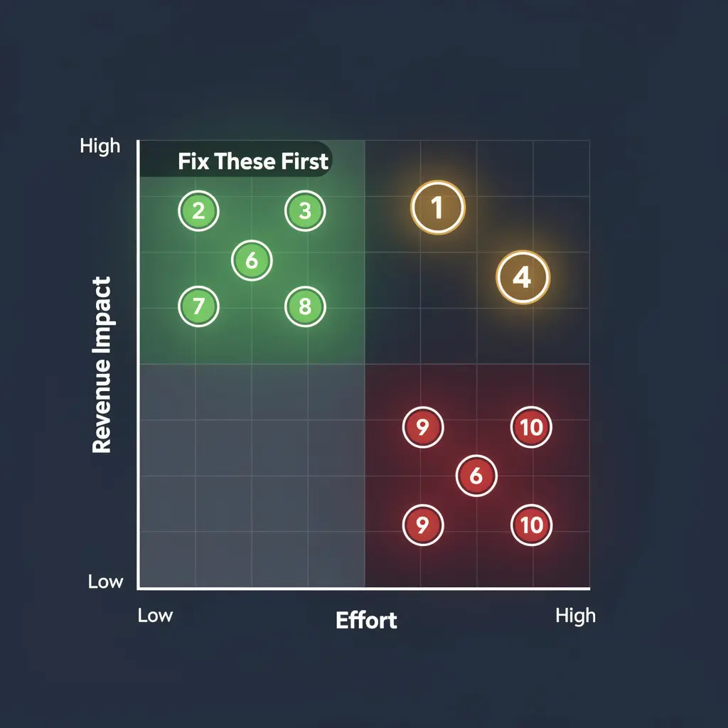
The Priority Matrix: Which Mistakes to Fix First
You can’t fix all 10 at once. Here’s how to prioritize based on impact versus effort:
| Priority | Mistake | Impact | Effort | Fix First If… |
|---|---|---|---|---|
| 🔴 1 | Slow mobile speed | Very High | Medium | PageSpeed score under 50 |
| 🔴 2 | Complicated checkout | Very High | Low | Cart abandonment over 75% |
| 🔴 3 | No trust signals | High | Low | High bounce rate on homepage |
| 🟡 4 | No reviews/social proof | High | Low | Products have zero reviews showing |
| 🟡 5 | Weak CTAs | High | Low | Low add-to-cart rate |
| 🟡 6 | Cart abandonment recovery | High | Low | No recovery emails active |
| 🟡 7 | Poor product content | High | High | Fewer than 3 photos per product |
| 🟢 8 | Mobile navigation | Medium | Medium | High mobile bounce rate |
| 🟢 9 | Desktop-first design | Medium | High | Mobile CVR below 0.5% |
| 🟢 10 | No post-purchase flow | Medium | Medium | Repeat customer rate under 15% |
Start with the red items. They have the highest revenue impact and most can be fixed within a week. If you need a systematic approach, our UX audit service identifies every issue, ranks them by revenue impact, and provides a prioritized fix roadmap.
Already diagnosed your Shopify store and found multiple issues from this list? Our in-depth guide on why your Shopify store has traffic but no sales walks through a complete 7-checkpoint diagnostic framework specifically for Shopify stores.
Frequently Asked Questions – Ecommerce Website Design Mistakes
Q: What is a good conversion rate for an ecommerce store in 2026?
A: The average ecommerce conversion rate is approximately 1.4% across all stores. Well-optimized stores achieve 2.5% to 3%. Top performers hit 4% or higher. If your store converts below 1%, there are likely fundamental design or UX issues to address. Above 2% means you’re outperforming most competitors, but there’s always room to optimize further.
Q: How do I know if my website design is hurting my sales?
A: Run the 60-second self-checks from each mistake listed above. Additionally, compare your store’s conversion rate to the 1.4% average benchmark. Check your mobile conversion rate separately: if it’s significantly lower than desktop, design issues are almost certainly the cause. High bounce rates (above 60%) and low pages-per-session (below 2) are also strong indicators of design problems.
Q: Which ecommerce design mistake has the biggest impact on revenue?
A: Slow mobile page speed is the single most expensive design mistake because it prevents visitors from ever seeing your products. Google’s data shows 53% of mobile visits are abandoned at 3+ seconds load time. However, checkout friction (Mistake #3) is often the easiest high-impact fix since enabling guest checkout and reducing form fields can be done in under an hour.
Q: How much does it cost to fix ecommerce conversion issues?
A: Many fixes in this article are free or under $50 per month (enabling guest checkout, compressing images, installing a review app, setting up abandoned cart emails). A professional ecommerce conversion audit and redesign typically costs $2,500 to $10,000 depending on store complexity. At BK Web Designs, our E-Commerce Growth package is $4,999 and covers a full audit plus implementation.
Q: Can I fix these design mistakes myself or do I need a professional?
A: Mistakes #2 (trust signals), #3 (checkout settings), #6 (review app), #7 (CTA improvements), and #8 (cart recovery emails) are all DIY-friendly and can be implemented over a weekend. Mistakes #1 (speed optimization), #4 (product content overhaul), #5 (navigation restructure), #9 (mobile redesign), and #10 (automation flows) often benefit from professional help due to their technical complexity.
Q: How long does it take to see results after fixing conversion issues?
A: Quick wins like checkout optimization and trust signal additions often show measurable improvement within 1 to 2 weeks. Speed improvements take 2 to 4 weeks to fully reflect in analytics as Google recrawls your site. Comprehensive redesigns typically show clear results within 30 to 60 days. Most of our clients see a measurable conversion rate lift within 45 days of implementing recommended changes.
🚀 Need Professional Help?
Fixing these mistakes yourself takes weeks. Our E-Commerce Growth package ($4,999) includes a full conversion audit, UX redesign, and 30 days of post-launch support. Most clients see measurable improvement within 60 days.