


Last Updated: March 2026 | Reading Time: ~12 min
TL;DR:
- Your traffic isn’t the problem, your store is. The average Shopify store converts at just 1.4%, meaning 98.6% of your visitors leave without buying. This post gives you the exact diagnostic framework to find why.
- We cover 7 conversion checkpoints from homepage trust signals to checkout friction, each with a specific test you can run right now and a DIY fix.
- Quick Answer: Download our free 27-Point Checklist, open your store on your phone, and start with Checkpoint #4 (Product Pages) it’s the highest-impact fix for most stores.
Table of Contents
Shopify store traffic, no sales. Five words that keep thousands of store owners awake at night. You’re getting 5,000 visitors a month, your ads are running, your products are solid, so why does your Shopify dashboard show 11 orders?
The Shopify store traffic no sales problem is the most expensive issue in ecommerce because you’re already paying for visitors who never convert. And every day you don’t find the leak, you’re burning money.
Here’s the hard truth: if your Shopify store has traffic but no sales, the traffic isn’t the problem, your store is. Somewhere between “visitor lands on your site” and “visitor clicks Place Order,” there’s a leak. Probably several.
And every day you don’t find them, you’re paying for visitors who will never buy.
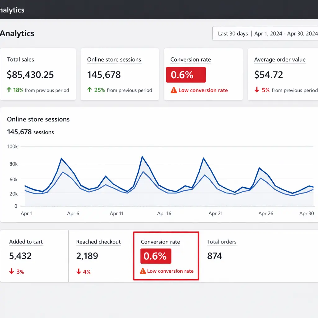
The average conversion rate for Shopify stores is just 1.4% – meaning only 14 out of every 1,000 visitors complete a purchase. If you’re below even that baseline, something is structurally broken.
At ByteKnight Creations, we’ve audited over 150 Shopify stores. The problems are almost always the same, and they’re almost always fixable. Below is our actual diagnostic framework, broken into 7 checkpoints, so you can identify YOUR specific conversion leak and fix it today.
📥 Free Resource: Download our 27-Point E-Commerce Conversion Checklist – the same framework we use to audit 150+ client stores. Print it. Walk through your store checkpoint by checkpoint. Find your leaks.
Shopify Store Traffic No Sales – Do You Actually Have a Conversion Problem?
Before you tear your store apart, let’s make sure you’re actually facing a Shopify store traffic no sales problem and not a traffic quality problem. The distinction matters. Not every traffic-with-no-sales issue is a UX problem some are targeting problems.
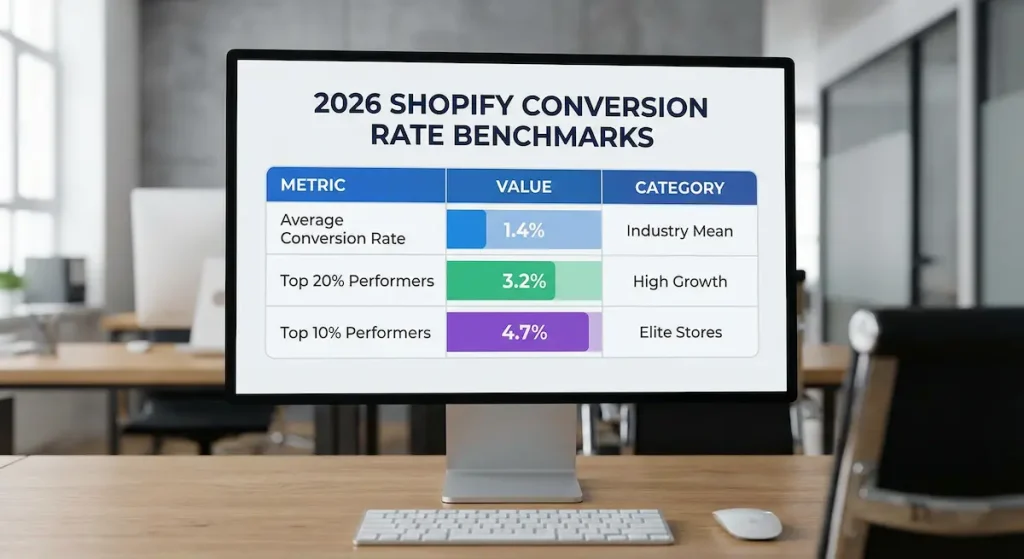
The Benchmarks That Actually Matter in 2026
Here’s where Shopify stores fall on the conversion spectrum:
| Performance Tier | Conversion Rate | What It Means |
|---|---|---|
| 🔴 Bottom 20% | Below 0.5% | Fundamental issues, poor traffic quality, technical bugs, or product-market misfit |
| 🟡 Average | 1.4% – 1.8% | Typical Shopify store with basic optimization |
| 🟢 Top 20% | 3.2%+ | Strong brand, optimized UX, quality traffic |
| 🏆 Top 10% | 4.7%+ | Exceptional product, seamless experience, sophisticated marketing |
According to Littledata’s Shopify benchmarks, the average Shopify conversion rate is 1.4%. Anything above 3.2% places you in the top 20% of all Shopify stores, and above 4.7% puts you in the top 10%.
Quick revenue formula to see what you’re leaving on the table:
Monthly Visitors × Conversion Rate × Average Order Value = Revenue
If you get 10,000 visitors per month with a $60 average order value:
- At 0.5% CVR → $3,000/month
- At 1.4% CVR → $8,400/month
- At 3.2% CVR → $19,200/month
Same traffic. Same products. Same ad spend. The only difference is what happens after the click.
Traffic Quality vs. Traffic Volume – The Distinction Most Store Owners Miss
Stores that drive most traffic from paid ads, SEO content, or top-of-funnel blog posts will almost always see lower conversion rates than stores fueled by returning customers, email lists, or loyal social followers. That doesn’t mean the strategy is wrong. it means you need to account for where your visitors are in the buying cycle.
Quick diagnostic: Open your GA4. Check your conversion rate by traffic source. If organic search converts at 2%+ but your paid traffic converts at 0.3%, you may not have a UX problem; you have a targeting problem. Fix your ads before you redesign your store.
If all sources are converting poorly? That’s a UX problem. Keep reading.
Healthy Store vs. Struggling Store: A Side-by-Side Comparison
To diagnose your Shopify store traffic no sales issue, you need to know what “healthy” looks like. Here’s what separates stores that convert from stores that don’t:
| Metric | 🔴 Struggling Store | 🟢 Healthy Store |
|---|---|---|
| Overall CVR | Below 0.8% | 2.0 – 3.5%+ |
| Mobile CVR | Below 0.5% | 1.5%+ |
| Bounce Rate | 70%+ | 35 – 55% |
| Avg. Page Load Time | 5+ seconds | Under 2.5 seconds |
| Cart Abandonment Rate | 80%+ | Below 65% |
| Add-to-Cart Rate | Below 3% | 7 – 10%+ |
| Pages per Session | 1.5 | 3.5+ |
| Product Page Has Reviews | No or hidden | Yes, above the fold |
| Mobile Checkout Optimized | No | Shop Pay + Apple Pay enabled |
| Trust Signals Visible | Buried in footer | Above the fold on every page |
If you see your store in the left column, the checkpoints below will tell you exactly where the bleeding is happening.
Checkpoint #1: First Impression and Homepage Trust Signals
THE PROBLEM: Your homepage doesn’t instantly communicate what you sell, who it’s for, or why a visitor should trust you. Visitors decide in under 5 seconds whether to stay or leave.
WHY IT MATTERS: On a recent client audit, we found that their hero section featured a beautiful lifestyle photo, but zero text, no value proposition, and no CTA. Their bounce rate was 78%. After we redesigned the hero with a clear headline, sub-headline, and a single “Shop Now” button, their bounce rate dropped to 52% within two weeks.
HOW TO CHECK: Open your homepage on a device you don’t usually use. Ask someone who’s never seen your store: “What do we sell? Who is it for? Would you trust this site with your credit card?” If they hesitate on any answer, you have a problem.
THE FIX:
- Hero section clarity. Your above-the-fold area needs three things; a headline that states what you sell, a sub-headline that communicates your unique value, and one clear primary CTA button.
- Trust bar. Add a horizontal strip below your hero with 4-5 confidence builders, free shipping threshold, return policy, secure checkout badge, review count, and any “as seen in” logos.
- Social proof above the fold. Display a star rating aggregate or a customer count (“Trusted by 12,000+ customers”) where visitors see it immediately.
WHEN TO HIRE HELP: If you’re struggling to articulate your value proposition or your theme doesn’t support the layout changes you need, a professional Shopify design service can rebuild your homepage around conversion, not just aesthetics.
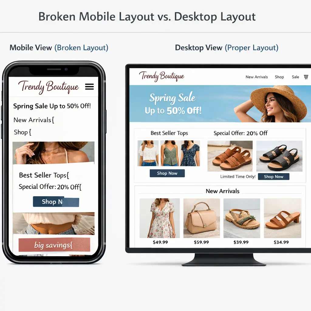
Checkpoint #2: Mobile UX: Where 79% of Your Traffic Lives
THE PROBLEM: Your store was designed on a desktop. It was approved on a desktop. But the vast majority of your customers are shopping on their phones and the experience is broken.
WHY IT MATTERS: Mobile devices account for approximately 79% of total traffic to Shopify stores, yet the average mobile conversion rate is just 1.2% compared to 1.9% on desktop. That gap represents thousands of dollars in lost revenue every month.
On one client’s store, we discovered that their “Add to Cart” button was partially hidden below the fold on iPhone screens. Fixing that single element, making it sticky at the bottom of the screen on mobile. increased their mobile add-to-cart rate by 34%.
HOW TO CHECK: Pick up your phone right now. Open your store. Try to buy something. Time it from homepage to checkout. If it takes more than 60 seconds or you encounter any frustration, your mobile visitors are experiencing the same thing and leaving.
THE FIX:
- Sticky add-to-cart button on all product pages. Most modern Shopify themes support this, check your theme settings under “Product page.”
- Tap target audit. Every button and link must be at least 48×48 pixels. If you’re squinting to tap something, so are your customers.
- Kill horizontal scrolling. Test every page on mobile. If anything extends beyond the screen edge, fix it, this alone tanks mobile trust.
- Optimize form inputs. Use the correct input types (tel for phone, email for email) so mobile keyboards auto-switch.
WHEN TO HIRE HELP: If your theme consistently breaks on mobile or you need a full responsive overhaul, this is the point where a UX audit from professionals saves more than it costs.
Checkpoint #3: Site Speed: The Silent Conversion Killer
THE PROBLEM: Your store loads in 5+ seconds, and you don’t even realize it because you’ve been testing on your high-speed office connection all day. Your customers, on spotty 4G in a coffee shop – are already gone.
WHY IT MATTERS: Google’s research found that 53% of mobile visits are abandoned if a page takes longer than 3 seconds to load. And making your website just one second faster can lead to a 7% rise in conversions. Speed isn’t a “nice to have”, it’s the foundation everything else sits on.
HOW TO CHECK: Run your store through Google PageSpeed Insights and GTmetrix. Focus on mobile scores. If your Largest Contentful Paint (LCP) is above 2.5 seconds, you’re losing visitors before they see a single product.
THE FIX:
- Compress every image. Install TinyIMG or Crush.pics and bulk-optimize. This is usually the single biggest speed win for Shopify stores.
- Audit your apps. Every installed Shopify app injects JavaScript into your store even apps you’re not actively using. Uninstall anything you don’t need. We’ve seen stores with 30+ apps installed and 18 of them doing nothing except slowing the site down.
- Defer non-critical JavaScript. If your theme allows it, move analytics scripts and non-essential widgets to load after the main page content.
WHEN TO HIRE HELP: Speed optimization gets technical fast especially when dealing with render-blocking resources, lazy loading, and theme code. If your PageSpeed score is below 40, professional intervention will save you weeks of trial and error.
Checkpoint #4 Product Pages That Sell (Not Just Display)
THE PROBLEM: Your product pages are information sheets, not sales pages. They display your product but don’t sell it. There’s one photo, a paragraph of specs, and a lonely “Add to Cart” button.
WHY IT MATTERS: The product page is where the buying decision happens. A study by the Spiegel Research Center at Northwestern University found that the purchase likelihood for a product with five reviews is 270% greater than the purchase likelihood of a product with no reviews.
On a recent client project, we found that simply moving review stars from below the fold to directly under the product title and adding a review count (“★★★★★ 127 Reviews”) increased their add-to-cart rate by 19%.
HOW TO CHECK: Open your top 5 best-selling products. For each one, ask yourself these questions: Can I see the product from at least 5 angles? Are there lifestyle or in-use photos? Is there a video? Can I see review stars without scrolling? Is the CTA button high-contrast and impossible to miss?
THE FIX:
- Minimum 5-8 product images plus 1 video. Include multiple angles, close-ups of texture and detail, a lifestyle image showing the product in use, and a size reference image.
- Install a review widget and feature it prominently. Judge.me or Loox are excellent options. Make sure the star rating summary appears above the fold, directly under the product title. Photo reviews generate even more trust than text alone.
- Rewrite descriptions around benefits, not features. Don’t say “Made from 600D polyester.” Say “Built from military-grade fabric that survives daily abuse we guarantee it for 5 years.” Lead with the outcome your customer wants.
- Add urgency and clarity signals. Stock count indicators (“Only 4 left”), shipping cutoff timers (“Order within 2 hours for next-day delivery”), and clear shipping cost information all drive faster purchase decisions.
WHEN TO HIRE HELP: If you need to overhaul product pages across 50+ SKUs, or your theme limits what you can display above the fold, our ecommerce website design services handle this end-to-end.
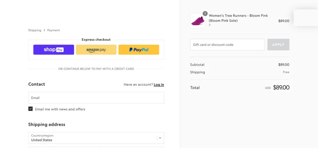
Checkpoint #5: Cart and Checkout Friction
THE PROBLEM: Visitors are adding products to their cart, then vanishing. Your checkout process is creating friction at the exact moment when customers are ready to pay.
WHY IT MATTERS: In 2026, the average cart abandonment rate reached 70.22%, according to Baymard Institute’s analysis of 50 different studies. That means roughly 7 out of every 10 shoppers who add an item to their cart will leave without completing the purchase.
The top reasons? Extra costs like shipping, taxes, and fees (47%), forced account creation (25%), and slow delivery estimates (24%). On one client’s store, we discovered that shipping costs weren’t displayed until the final checkout step. Adding a shipping calculator to the cart page reduced their cart abandonment by 18%.
HOW TO CHECK: Go to your store right now. Add a product to the cart. Go through your entire checkout process as a first-time customer. Note every point of friction: Are you forced to create an account? Do shipping costs appear late? How many form fields are there? How many payment options are available?
THE FIX:
- Enable guest checkout. Go to Settings → Checkout in your Shopify admin and remove forced account creation. Over a quarter of customers abandon carts when forced to register.
- Show total costs EARLY. Display shipping costs on the product page or cart page never surprise customers at the final step.
- Enable accelerated checkout. Shop Pay lifts conversion by up to 50% compared to standard guest checkout. Also add Apple Pay and Google Pay.
- Minimize form fields. Baymard’s usability research recommends an ideal checkout with 7-8 form fields maximum. Remove everything that isn’t strictly necessary.
- Add trust badges on the checkout page itself. Secure payment icons, money-back guarantee, and your return policy should be visible at the moment customers enter their credit card.
- Offer Buy Now, Pay Later for orders over $100. Klarna, Afterpay, or Shop Pay Installments reduce price sensitivity and boost average order value.
- Set up abandoned cart emails. A 3-email sequence (1 hour, 24 hours, and 72 hours post-abandonment) can recover 5-15% of abandoned carts.
WHEN TO HIRE HELP: If you’re on Shopify Plus and need custom checkout modifications, or your abandonment rate exceeds 75% despite implementing these fixes, a dedicated CRO specialist can diagnose deeper structural issues.
Checkpoint #6: Navigation and Site Architecture
THE PROBLEM: Visitors can’t find what they’re looking for. Your navigation is organized around how you think about your products, not how your customers search for them.
WHY IT MATTERS: If a visitor can’t find the right product within 3 clicks, they leave and they won’t use your search bar, they’ll just go to a competitor. On a client’s jewelry store, we reorganized navigation from material-based categories (“Sterling Silver,” “14K Gold,” “Brass”) to occasion-based categories (“Wedding,” “Everyday,” “Gift Sets”). Their pages-per-session increased from 2.1 to 3.8, and their conversion rate jumped by 27%.
HOW TO CHECK: Ask 3 people who aren’t familiar with your store to find a specific product. Time them and watch where they click. If they struggle, hesitate, or resort to the search bar as a crutch, your navigation is failing.
THE FIX:
- Limit top-level menu items to 5-7. More than that creates decision paralysis. Use dropdown menus for subcategories.
- Organize by customer intent, not internal taxonomy. Think “Shop by Category,” “Shop by Occasion,” “New Arrivals,” and “Best Sellers” not your internal SKU logic.
- Make search prominent and powerful. Shopify’s default search is weak. Upgrade to Searchanise or Boost Commerce for autocomplete, typo tolerance, and “did you mean” suggestions.
- Add filters that matter. Price range, size, color, rating, and availability. Let customers narrow down results quickly rather than scrolling through pages of products.
WHEN TO HIRE HELP: If you have a large catalog of 100+ products and your site architecture developed organically over time, a professional information architecture audit can restructure your store around how customers actually shop.
Checkpoint #7: Post-Click Experience (The Invisible Leaks)
THE PROBLEM: There are small, easy-to-miss elements on your store that erode trust or create annoyance pop-ups that fire too early, missing return policies, and unclear shipping timelines.
WHY IT MATTERS: These aren’t dramatic conversion killers like a broken checkout they’re slow leaks. Individually, each might cost you 0.5-2% of conversions, but combined they add up fast. On one client audit, we found an aggressive email pop-up that fired within 2 seconds of landing on mobile. It covered the entire screen and the close button was nearly impossible to tap. Disabling it reduced their mobile bounce rate by 12% overnight.
HOW TO CHECK: Visit your store in an incognito browser window on your phone. Note every pop-up, banner, and announcement bar. Then check: Is your return policy easily accessible from product pages? Are shipping timelines clearly stated? Is there a visible money-back guarantee?
THE FIX:
- Pop-up rules. No pop-up within the first 5 seconds. Maximum one pop-up per session. On mobile, use a small bottom banner instead of a full-screen overlay.
- Exit-intent on desktop can recover 5-15% of bouncing visitors but only if the offer is genuinely relevant, such as a discount code, free shipping threshold, or a valuable free resource.
- Shipping and returns transparency. Add a dedicated FAQ or policy section accessible from every product page and the footer. Show estimated delivery dates, not just “5-7 business days.”
- Money-back guarantee badge near every CTA. A simple “30-Day Money-Back Guarantee” icon next to the Add to Cart button removes the last barrier to purchase.
WHEN TO HIRE HELP: If you’re unsure which small changes to prioritize, or you want data-driven answers instead of guesswork, a professional UX audit identifies every leak and ranks fixes by estimated revenue impact so you work on the highest-value items first.
Your 5-Minute Action Plan: Stop Losing Sales Today
If you’ve read this far, you’ve already diagnosed your Shopify store traffic no sales problem. Now it’s time to act. You don’t need to fix everything at once — here are the 5 highest-impact actions you can take in the next 5 minutes:
- 📱 Open your store on your phone. Try to buy something. Note every frustration point. This single exercise reveals more problems than any analytics dashboard.
- ⚡ Run a speed test. Go to Google PageSpeed Insights, enter your URL, and check your mobile score. If it’s below 50, your speed is actively costing you sales.
- 🔍 Check your checkout settings. Go to Settings → Checkout in your Shopify admin. Enable guest checkout. Enable Shop Pay. These two toggles alone can meaningfully lift your conversion rate.
- ⭐ Move review stars above the fold. If you have reviews buried at the bottom of your product pages, move the star summary to directly under the product title. This takes 10 minutes and can impact conversions immediately.
- 📥 Download the 27-Point Checklist and systematically walk through every remaining checkpoint this week. Mark each item as “pass,” “fail,” or “needs improvement.” That becomes your conversion optimization roadmap.
FAQ: Shopify Store Traffic No Sales
Here are the most common questions store owners ask about the Shopify store traffic no sales problem, answered with data and actionable fixes.
What is a good conversion rate for a Shopify store in 2026?
The average Shopify store converts at 1.4%. Stores above 3.2% rank in the top 20%, while those hitting 4.7% or higher place in the top 10%. If your conversion rate is below 1%, you likely have fundamental issues with UX, trust signals, or traffic quality that need immediate attention.
How do I check my Shopify store’s conversion rate?
In your Shopify admin, navigate to Analytics → Dashboards where your online store conversion rate is displayed prominently. Click into it to see conversion rate broken down by device type and traffic source, this reveals where the problem lives, not just that one exists.
Why is my Shopify conversion rate so low on mobile?
Shopify’s average mobile conversion rate is 1.2% versus 1.9% on desktop. Common mobile killers include tap targets smaller than 48 pixels, missing sticky add-to-cart buttons, page load times exceeding 3 seconds, checkout forms not optimized for mobile keyboards, and aggressive pop-ups that cover the entire screen.
How do I reduce cart abandonment on Shopify?
Start with three high-impact fixes: enable guest checkout (forced registration drives away 25% of buyers), display shipping costs before the checkout page so there are no surprises, and enable Shop Pay plus Apple Pay for accelerated payments. Then set up a 3-email abandoned cart recovery sequence to recapture 5-15% of lost sales.
Should I hire someone to fix my Shopify conversion rate?
Start with the DIY fixes in this guide; trust signals, speed optimization, checkout settings, and review placement cost nothing and take hours, not weeks. If your conversion rate stays below 1% after implementing these changes, or you need a full UX overhaul across dozens of product pages, it’s time for a professional Shopify optimization team.
🚀 Need Professional Help?
Our Shopify Growth Package ($4,999) includes a complete conversion optimization audit plus a custom redesign the same 27-point framework from this post, applied to your store by our team, with every fix implemented for you.
Book a free 15-minute strategy call: us.bkwebdesigns.com/contact
We’ll review your store live on the call and tell you the #1 thing costing you sales whether you hire us or not.