


TL;DR:
- Mobile devices now drive 78% of ecommerce traffic but convert at roughly half the rate of desktop. That gap is costing you real money every single month.
- This guide includes a 10-point mobile audit you can do in 15 minutes using just your phone. No developer tools needed. Each check has a specific pass/fail standard.
- Quick Answer: Mobile first website design in 2026 means designing for phones first and enhancing for desktop second. If your site was built the other way around (most are), your mobile visitors are having a worse experience than you think, and Google is ranking you based on that inferior mobile version.
Table of Contents

Mobile first website design in 2026 isn’t a trend or a “nice to have.” It’s how Google ranks your website, how the majority of your visitors experience your brand, and increasingly, how they decide whether to buy from you or your competitor.
Here’s the uncomfortable reality: mobile devices now drive 78% of global ecommerce traffic according to multiple 2026 data sources. Yet the average mobile ecommerce conversion rate is just 1.8% compared to 3.9% on desktop. That means your mobile visitors convert at less than half the rate of desktop visitors. And since mobile is where most of your traffic lives, that gap represents a massive revenue leak.
Most business owners know “mobile matters” in theory. But very few have actually tested their website on a phone recently. And when they do, they’re often shocked by what they find: buttons too small to tap, text requiring pinch-to-zoom, forms that are painful to fill out, and pages that take 5+ seconds to load. This guide gives you a practical 15-minute audit you can run on your own phone, shows you exactly how much bad mobile UX is costing you, and explains the specific fixes that close the gap.
The Uncomfortable Math: How Much Bad Mobile UX Is Costing You
Let’s turn the conversion gap into real dollars. This isn’t theoretical. It’s basic arithmetic that most business owners have never done.
According to recent industry data, desktop conversion rates average approximately 3.9% while mobile conversion rates average 1.8%. Desktop conversion rates are consistently about 2x higher than mobile across all traffic sources. That’s not because mobile shoppers don’t want to buy. It’s because most websites deliver a worse experience on the device most people are using.
Here’s the revenue calculation:
- Your store gets 10,000 visitors per month
- 78% are mobile = 7,800 mobile visitors
- At 1.8% mobile CVR = 140 mobile orders
- At 3.9% desktop-equivalent CVR = 304 mobile orders
- At $100 average order value: you’re losing $16,400 per month in unrealized mobile revenue
- That’s $196,800 per year from one problem
You don’t need to fully close the gap. Even improving your mobile conversion rate from 1.8% to 2.5% (still below desktop) would capture an additional $5,460/month in our example. That’s $65,520/year from mobile UX improvements alone.
📥 Free Resource: Want a complete picture of your website’s health? Our free 10-Point Website Redesign Audit covers mobile UX, speed, SEO, and conversion elements. Takes 30 minutes and could save you thousands.
Download Free Checklist →

Mobile-First vs Mobile-Responsive: They Are NOT the Same Thing
This distinction matters more than most business owners realize. The terms sound similar but describe fundamentally different approaches to design.
Mobile-Responsive (The Old Way)
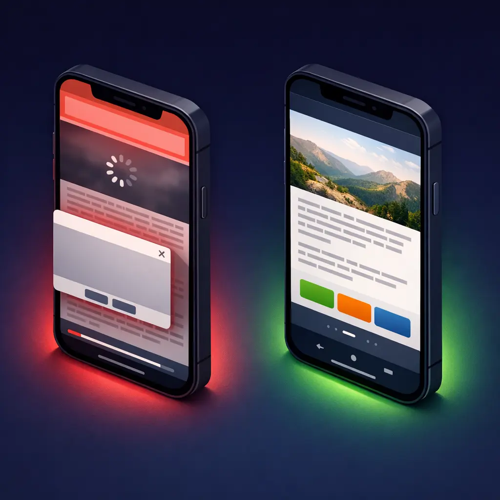
Responsive design starts with the desktop version and uses CSS rules to shrink, stack, and rearrange elements to fit smaller screens. Your site technically “works” on a phone. But it was designed for a mouse and a 15-inch screen, then adapted. Navigation menus get crammed into hamburger icons. Images designed for widescreen monitors get squeezed. Buttons sized for mouse clicks become tiny tap targets. It’s like taking a king-size bedsheet and trying to fit it on a single bed. It covers the surface, but the experience is compromised.
Mobile-First (The 2026 Standard)
Mobile-first design starts with the smallest screen and works upward. You design the phone experience first, with thumb-friendly navigation, appropriately sized text, streamlined content, and fast load times. Then you enhance and expand for tablet and desktop. This approach ensures the majority of your visitors (the mobile ones) get the best possible experience, not a downsized version of a desktop site.
Why this matters for Google: Mobile-first indexing is now fully complete. Google uses the mobile version of your website for all indexing and ranking decisions. If your mobile experience is inferior to your desktop experience, Google ranks you based on that inferior version. It doesn’t matter how beautiful your desktop site is. Google isn’t looking at it anymore.
The 10-Point Mobile Audit You Can Do in 15 Minutes
Grab your phone. Open your website in a browser (not an app preview). Go through each check below and score yourself honestly. No developer tools needed.
| Check | What to Test | Pass Standard | Score (1-5) |
|---|---|---|---|
| 1. Text Readability | Read body text without zooming or squinting | 16px minimum body font, high contrast | ___ |
| 2. Button Size | Tap all buttons and links with your thumb | 44px x 44px minimum tap target | ___ |
| 3. Thumb Navigation | Reach main menu and CTA with one hand | Key actions in bottom 60% of screen | ___ |
| 4. Load Speed | Run PageSpeed Insights on mobile | Score 70+ and LCP under 2.5 seconds | ___ |
| 5. Form Usability | Complete your own contact form on phone | Finish in under 60 seconds | ___ |
| 6. Image Loading | Scroll entire homepage watching images | No broken images or layout shifts | ___ |
| 7. Pop-up Behavior | Trigger any pop-ups and try closing them | Easy to close, not blocking content | ___ |
| 8. Checkout (Ecommerce) | Start a test purchase on your phone | Completable in under 2 minutes | ___ |
| 9. Search Function | Search for a product or page by name | Returns relevant results within 2 seconds | ___ |
| 10. Click-to-Call | Tap your phone number and address | Phone initiates call, address opens maps | ___ |
| TOTAL | Target: 40+ out of 50 | ___ |
Scored below 30? Your mobile experience is actively losing customers. 30 to 40? Significant room for improvement. 40+? Your mobile UX is solid. Focus on speed optimization and conversion rate testing.
If your Shopify store specifically scored poorly, our detailed guide on why Shopify stores get traffic but no sales walks through a complete 7-checkpoint diagnostic including mobile-specific issues.
7 Mobile UX Killers We Find on 80% of Sites We Audit
After auditing hundreds of websites at BK Web Designs, these seven issues appear with alarming consistency. If you’ve read the common mistakes in our guide on ecommerce design mistakes that kill conversions, several of these will feel familiar, but here we go deeper on the mobile-specific causes and fixes.
1. Hamburger Menus With 30+ Items
Your mega-menu looked organized on desktop. On mobile, it’s an endless vertical scroll of 30 to 40 text links crammed into a hamburger menu. Nobody scrolls that far. Research on thumb-zone interaction shows that 75% of users interact with phones using just one thumb. Links buried more than two scrolls deep in a mobile menu might as well not exist. Fix: Limit mobile menu to 5 to 7 top-level items. Use expandable sub-menus only when necessary.
2. Horizontal Scrolling Tables and Content
Data tables designed for wide desktop screens become unreadable on mobile. Users have to scroll horizontally, which breaks the natural vertical flow and makes comparison impossible. Fix: Convert tables to stacked card layouts on mobile, or use responsive table plugins that collapse columns intelligently.
3. Fixed Headers Eating 25% of Screen Space
A sticky header with your logo, search bar, announcement banner, and navigation can consume 120px or more of a mobile screen that’s only 660px tall. That’s 18% of usable space permanently gone. Fix: Auto-hide the header on scroll down, show it on scroll up. Keep fixed headers under 60px on mobile.
4. Desktop-Sized Images Loading on Mobile
Your hero image is 2400px wide and 1.2MB. On a 390px-wide phone screen, 80% of those pixels and kilobytes are wasted, and they’re the primary reason your mobile page takes 5+ seconds to load. Google’s research confirms 53% of mobile visitors abandon sites taking over 3 seconds. Fix: Use responsive images with srcset attributes or serve WebP format. Target under 100KB per image on mobile.
5. Tiny “X” Buttons on Pop-ups
A pop-up with an 8px close button is frustrating on desktop. On mobile, it’s infuriating. Users tap the wrong thing, accidentally submit forms, or give up entirely and leave. A restaurant client of ours had a newsletter pop-up with a close button so small that 40% of mobile users were bouncing within 3 seconds of it appearing. Replacing it with a dismissible bottom banner reduced their mobile bounce rate by 15%. Fix: Minimum 44px close button. Or better yet, use bottom slide-up banners instead of overlays on mobile.
6. Forms With 10+ Fields on One Page
What takes 30 seconds to fill on desktop takes 3 minutes on a phone. Every field is a chance for the visitor to get distracted, frustrated, or give up. Mobile keyboards are slower. Autocomplete doesn’t always work. Scrolling between fields is disorienting. Fix: Reduce to 5 to 7 fields maximum. Use multi-step forms where each step has only 2 to 3 fields. Enable autofill-friendly input types.
7. Auto-Playing Videos Draining Data and Battery
Background videos that auto-play look cinematic on desktop. On mobile, they drain battery, consume cellular data, and slow page load dramatically. Many mobile users are on metered connections. Fix: Disable auto-play on mobile. Show a static thumbnail with a play button instead. Load the video only when the user taps.
Mobile-First Design Principles That Actually Increase Conversions
Beyond avoiding mistakes, here are specific design patterns that actively boost mobile conversion rates.
| Principle | What It Means | Business Impact | Difficulty |
|---|---|---|---|
| Thumb-Zone Design | Place key actions where thumbs naturally reach (bottom 60% of screen) | 20% more CTA taps | Medium |
| Progressive Disclosure | Show summary first, expand details on tap | 30% lower bounce rate | Medium |
| Sticky Bottom CTA | Fixed button bar at bottom of screen (within thumb reach) | 15% more conversions | Easy |
| Mobile Wallet Payments | Apple Pay, Google Pay at checkout | 12% fewer abandoned carts | Medium |
| Optimized Images | Serve WebP format, lazy load below the fold | 40% faster load time | Easy |
| Simplified Navigation | Maximum 5 to 7 main menu items on mobile | 25% more pages explored | Easy |
| Click-to-Call Buttons | Tappable phone buttons, not just displayed numbers | 3x more phone inquiries | Very Easy |
A restaurant client of ours doubled their mobile reservations after we implemented three changes: replaced their desktop-style menu page with a thumb-friendly scrollable card layout, added a sticky “Reserve a Table” button at the bottom of every page, and made their phone number a tappable click-to-call button instead of plain text. Total implementation time: two days. Impact on monthly reservations: up 108%.
For Shopify stores specifically, sticky add-to-cart bars, mobile-optimized product image galleries with swipe and pinch-to-zoom, and one-tap checkout via Shop Pay are the highest-impact mobile optimizations available.
The 2026 Mobile Features Your Competitors Are Already Using
Mobile design in 2026 goes beyond responsive layouts. These are the features forward-thinking businesses are implementing right now.
Progressive Web Apps (PWAs)
PWAs deliver app-like experiences through the browser: offline access, push notifications, home screen installation, and instant loading. According to Adobe’s data, progressive web apps can deliver up to a 36% uplift in mobile conversions compared to standard mobile websites. You don’t need a native app. A PWA gives your customers the benefits of an app without requiring a download from any app store.
Mobile Wallet Payments
Digital wallets are dominating checkout. An estimated 54% of all online transactions globally are now processed through mobile wallets like Apple Pay, Google Pay, and Shop Pay. For mobile shoppers, tapping a biometric sensor is infinitely easier than typing 16 credit card digits on a tiny keyboard. If your checkout doesn’t support wallet payments in 2026, you’re creating unnecessary friction at the worst possible moment.
Voice Search Optimization
Nearly 97% of mobile users already use voice search or an AI-powered voice assistant according to recent ecommerce data. Voice queries tend to be longer and more conversational: “best plumber near me open right now” instead of “plumber NYC.” Structuring your content to answer these natural-language questions (especially in FAQ sections and service pages) helps capture this growing mobile search behavior.
App-Like Interactions Without an App
Swipe gestures for product galleries, pull-to-refresh for inventory updates, haptic feedback on button taps, and smooth page transitions create an experience that feels native without requiring app store distribution. Modern CSS and JavaScript frameworks make these interactions possible on standard mobile websites. They signal to mobile visitors that your business takes their experience seriously.

The Mobile vs Desktop Performance Gap (Full Data)
Here’s the complete performance comparison so you can benchmark your own site against current averages:
| Metric | Desktop Average | Mobile Average | Revenue Impact |
|---|---|---|---|
| Conversion Rate | 3.9% | 1.8% | Mobile converts 54% worse |
| Bounce Rate | 35% | 51% | Half your mobile visitors leave immediately |
| Page Load Time | 1.3 seconds | 2.6 seconds | Every extra second costs 7% conversions |
| Average Session | 5.2 minutes | 3.1 minutes | Mobile users browse 40% less content |
| Cart Abandonment | 73% | 85.65% | Mobile checkout friction is extreme |
| Pages Per Session | 4.2 | 2.8 | Mobile users see fewer products |
Every row in this table represents a fixable problem. The gap exists not because mobile is inherently worse for shopping, but because most websites were designed for desktop first and adapted for mobile as an afterthought. A professional mobile-first UX audit identifies exactly which of these metrics is weakest on your site and prioritizes fixes by revenue impact.
Frequently Asked Questions
Q: What is the difference between mobile-first and mobile-responsive design?
A: Mobile-responsive means your desktop site adapts to fit smaller screens, shrinking and stacking elements. Mobile-first means you design for phone screens first, then enhance for desktop. The result looks similar but the approach is fundamentally different. Mobile-first ensures the majority of your visitors (78% of ecommerce traffic) get the primary, optimized experience rather than a scaled-down compromise.
Q: How do I test if my website is mobile-friendly?
A: Start with the 10-point audit in this guide using just your phone. For technical data, run your URL through Google PageSpeed Insights and check the mobile tab. Google Search Console also flags mobile usability issues under the “Experience” section. If you score below 30 on our audit or below 50 on PageSpeed, your mobile experience needs immediate attention.
Q: Does Google penalize websites that aren’t mobile-friendly?
A: Google doesn’t apply a direct “penalty” but the effect is the same. Mobile-first indexing is now fully complete. Google uses the mobile version of your site for all crawling, indexing, and ranking decisions. If your mobile version is slow, missing content, or poorly designed, that inferior experience is what Google ranks you on. A bad mobile site means lower rankings, less visibility, and less traffic across all devices.
Q: How much does it cost to make my website mobile-first?
A: It depends on your starting point. Simple mobile UX fixes (button sizes, font scaling, image compression, pop-up behavior) can often be implemented for $500 to $1,500. A full mobile-first redesign from a professional agency typically costs $3,000 to $10,000 depending on site complexity. Given that poor mobile UX can cost $50,000+ per year in lost revenue, the ROI on mobile optimization is among the highest of any investment you can make.
Q: Will redesigning for mobile affect my desktop experience?
A: No, when done properly. Mobile-first design enhances for desktop, it doesn’t diminish it. Desktop gets a richer experience with more whitespace, expanded content sections, and larger imagery. The mobile-first approach simply ensures the phone experience is designed with intention rather than treated as an afterthought. In fact, mobile-first thinking often improves desktop layouts too by forcing cleaner hierarchy and faster loading.
Q: What is a Progressive Web App and does my business need one?
A Progressive Web App (PWA) is a website that behaves like a native mobile app: it can work offline, send push notifications, be installed on a home screen, and load almost instantly. Adobe’s data shows PWAs can deliver up to 36% higher mobile conversions compared to standard mobile websites. You likely need a PWA if your mobile traffic exceeds 60% of total traffic, customers visit frequently, or you want app-like engagement without the cost of native app development.
🚀 Need Professional Help?
Your mobile visitors deserve better. Our UI/UX Design packages start at $2,000 and include a complete mobile-first audit, wireframing, and responsive redesign. Most clients see their mobile conversion rate double within 60 days of launch.